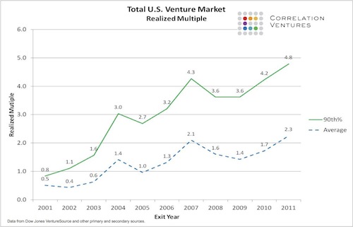
Correlation Ventures, a new analytics-driven venture firm, just came out with some interesting data on US venture capital returns over the past decade.
Instead of taking a “birth” vintage approach to returns, which is the way venture fund vintages and most benchmarking analyses tend to cut the data, Correlation Ventures’ team has chosen to look at all the realized exits and their returns in any given year. This data is based on financings (e.g., Series A and B rounds in the same company are two data points), and includes all prior financings into companies that went out of business, got sold, or got public (IPO) in that year. They are also dollar-weighted (e.g., for the top decile, or 90th percentile, 10% of all the dollar’s invested in financings of companies that exited in that year were above the realized multiple). Since 2003, each year represents 500-700 exits and over 2000 financings – so it’s a very robust dataset.
Three observations worth calling out from this – though all are obvious from the chart:
First, top decile venture financings yield attractive return multiples. A top 10% outcome has delivered above ~4x over the last 5 years, aggregating all sectors of venture capital. For a sense of proportion, this represents the top 200 or so financings into companies that exited that year (ranging between 50-100 exited companies per year). This is very much in line with data Bijan Salehizadeh and I published in Nature Biotech last year: top decile outcome was roughly 4x for exited companies first invested in during the last decade (with a slight edge to Life Science vs Technology top decile deals). Although not in the chart above, Correlation’s database estimates Top 1% of financings (5-10 top exits per year) have been in the 15x range for the past five years; these are much more likely to be Technology deals. This also implies that the ‘halo’ lottery-ticket deals in the 100x+ range are in the Top 0.25% or less (top 1-2 deals out of 700+ exits in any given year). Its hard to base an investing strategy on being in the top 0.25% of anything. This is similar to data flying around Twitter earlier this month (here).
Second, venture-backed exits have been getting better over the decade. This is obviously good news for those of us in venture and in the startup ecosystem. Returns have rather steadily moved upward across the 2000s, with a minor correction in the 2008-2009 timeframe. Top decile returns nearly reached 5x in 2011, and the average exit is now above 2x. This trend clearly bodes well for venture capital.
Third, the big albatross on returns has been the post-bubble crisis. The horrific average and top decile returns in the exit vintages of 2001-2003 represent lots of the companies that got flushed out when the bubble burst. Many of these raised capital at the high equity valuations and when the lofty markets collapsed, they fell to the ground hard. But lots of companies from that vintage survived, albeit wounded, and many entrepreneurs and their venture backers spent much of the decade trying to recoup their equity values for their LP’s. Part of the positive trend in the chart above is that companies born in those challenging bubble years have been exiting and now represent a smaller proportion of the exit universe.
Given how little transparency there is on venture capital returns, its nice to see some additional data on the topic – so thanks to Correlation Ventures for letting me share this material.
For those that don’t know them, Correlation has a unique data-rich investment approach: applying predictive analytics to the likelihood of a deal being successful, and using that knowledge to inform rapid co-investment decisions around new financings. They’ve built a robust database to support these analytics, and have made ~30 investments to date across a range of sectors. Definitely worth checking them out. I’m working with them on some additional analyses that should shed more light on sector return profiles and other topics. More to come.


