


2018 has so far been another gangbuster year for biotech IPOs: the first three quarters of the year have delivered nearly 50 new biotech offerings, reinforcing the strong new issuance performance of the past 6 years.
With lots of pundits raising concerns about the market overheating with positivity on good days, or over-selling negativity on bad days, it’s worth reflecting on how the data this year actually matches up in terms of post-IPO share performance versus prior years.
Geoffrey Porges at Leerink recently put out a great report looking at the entire IPO window from 2013-2018 and the returns generating by new biotech offerings. It’s as you might expect: the measure of central tendency of the performance distribution (medians, means) are not attractive, but, the best winners, roughly 20% at the top and reflective of the Pareto power law, captured most of the share price and valuation gains.
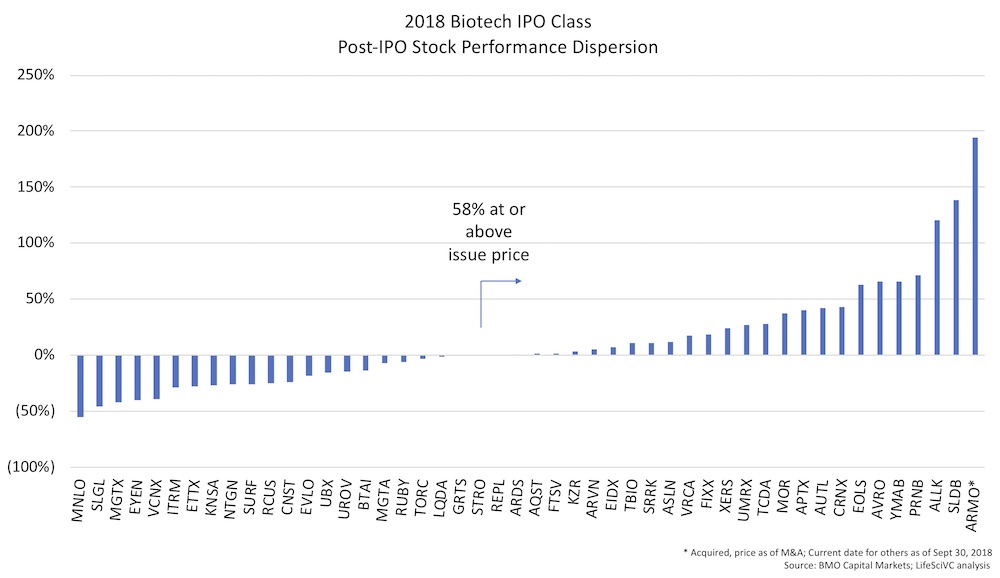
Based on some IPO share price performance data from BMO Capital Markets, here’s the dispersion plot of the 48 biotech IPOs that went public through Sept 30, 2018. As is evident in the chart, the majority (58%) are at or above their IPO price. A few big winners, like ARMO, Solid Biosciences, and Allakos, have delivered great returns; whereas bad data can blow up a stock quickly (as was the case with Menlo).
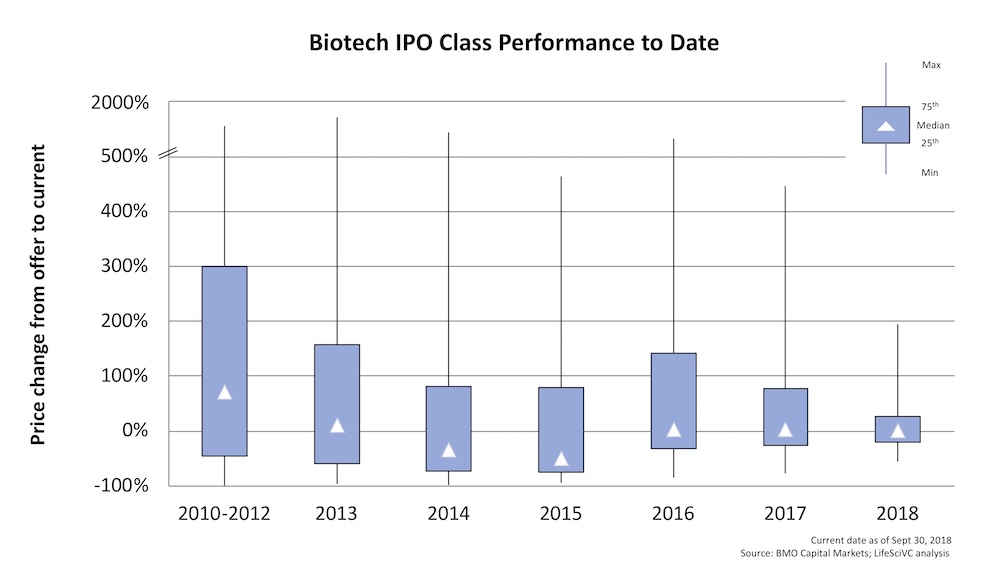
Comparing this performance distribution to prior annual IPO cohorts, many of whom have had longer time to season on the markets, is as you might expect: the dispersion in share price performance at the top and bottom gets wider with longer time in the markets (including the 75th and 25th percentiles of the distribution). The median change from IPO price of the entire group since 2010 is -2.9%, but the mean (pulled upwards by the big outliers) is 69%. 2015, which marked the NASDAQ Biotech Index all-time-high in July of that year, saw the worst performance, with significant negative median returns to date (-50%) – though the top quartile has delivered north of 80% gains over the last three years.
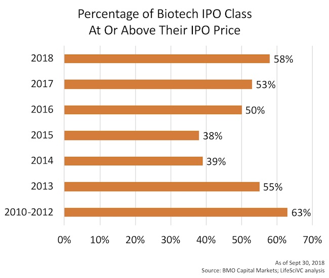
Another way to look at the dispersion of post-market performance is what proportion of the IPO class remains above their initial offer price. Historically, this range is generally 40-60% at any given point in time following the IPO. For instance, as of October 2007, near the prior decade’s market peak, 41% of the biotech IPOs from 2003-2007 were above their offer price; through the financial crisis, things got worse, so by June 2009 (near the bottom), only 21% were above their IPO price. The recent vintages have faired far better.
As of Sept 30th, here’s the breakdown of the recent window by year. For the 2018, IPO class 58% of them remain above their IPO price. Less than 40% of the 2014 and 2015 classes are above water at this point. These proportions are likely slightly lower as of mid-October, given the volatility over the past two weeks.
But volatility is an endemic feature of biotech – and it’s not going away. We have an event-driven business, where data readouts can have dramatic effects. Sentiment changes even in the absence of data can move stocks. No news flow often chips away at a stock price over time. And liquidity is very tight, allowing small changes in the buying/selling of stock to lead to big price changes.
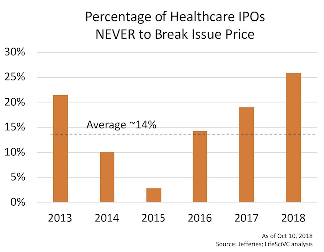
To capture the volatility of post-IPO companies, upon request Matthew Kim at Jefferies had his team conduct an interesting analysis: what percentage of IPOs never, ever break their initial offer price? According to this Jefferies’ analysis, since 2013, only 14% of healthcare companies have never broken issue. This holds true for only biotech IPOs as well (their analysis included diagnostics, devices, etc). Even great high fliers like Agios and Juno broke their offer prices at some point following their IPOs. Given the impact of market timing and volatility, it makes sense that 2015 has more broken IPOs (i.e. it was after all the NASDAQ Biotech Index peak), and that in general more recent cohorts have higher percentage of as-yet-never-broken IPOs.
Lastly, for most readers, it’s stating the obvious to say the 2013-2018 has been the most active IPO period in the history of biotech. And a wonderful treasure trove of data, of course, for this blog and others.
One measure of activity that isn’t often talked about is the consistency of IPOs in the market. In most prior years since the dawn of biotech, there have been long periods of many months with no IPO activity at all. Since March 2013, when the current window really began to open, we’ve seen 66 months pass. According to BMO Capital Markets data, in only 4 of those months did we not witness at least one IPO. And those were in two two-month blocks: Dec-Jan 2016 and Feb-Mar 2017. All of the other 62 months had at least one biotech IPO, averaging more than one biotech IPO per week for nearly 6 years.
These trends around post-IPO volatility and dispersion of share price performance will certainly continue around the following general themes:
- We should expect 40-60% of a cohort of IPOs to trade below their IPO price, especially with ample market seasoning (time from IPO).
- The vast majority of biotech IPOs will break issue and go below their offer price at some point in their journey of bringing a medicine(s) through development
- Less than 20% of the offerings will continue to drive the vast majority of post-IPO market returns.
- Given the persistent level of IPO activity, we’ve likely moved into a period where solid companies with credible therapeutic product candidates can get public in (almost) any macro backdrop.
In short, these data and others suggest we’re operating in a much more mature and resilient capital market environment than existed in the early decades of biotech.